


Transform your data into insights with a stunning box-and-whisker plot! Learn what it is and how to create one with ease using JavaScript. In this tutorial, I’ll walk you through the steps to make a neat and visually appealing JS-based (HTML5) box chart with the yearly gross salaries of different IT professions in Europe. Unlock the power of data visualization and start quickly identifying trends and patterns today!
What Is Box-and-Whisker Plot?
A box-and-whisker plot, or simply a box plot or a box chart, is a type of graphical representation commonly used in statistical analysis to display the distribution of a dataset. The plot consists of a rectangular box that spans the first quartile to the third quartile (also known as the interquartile range, or IQR), with a horizontal line inside representing the median.
In addition to the box, lines (called whiskers) can extend from the box, indicating variability outside the upper and lower quartiles. These whiskers can represent different things depending on the context, such as the maximum and minimum values within a specific range or a multiple of the standard deviation.
Outliers, which differ significantly from the rest of the dataset, may be plotted as individual points beyond the whiskers on the box plot. The presence of outliers can provide valuable insights into the distribution of the data and help identify potential errors or anomalies in the data.
Box-and-Whisker Plot to Be Built
To pique your interest in building a creative chart, let me give you a sneak peek at the final box-and-whisker plot that will be completed by the end of this tutorial.
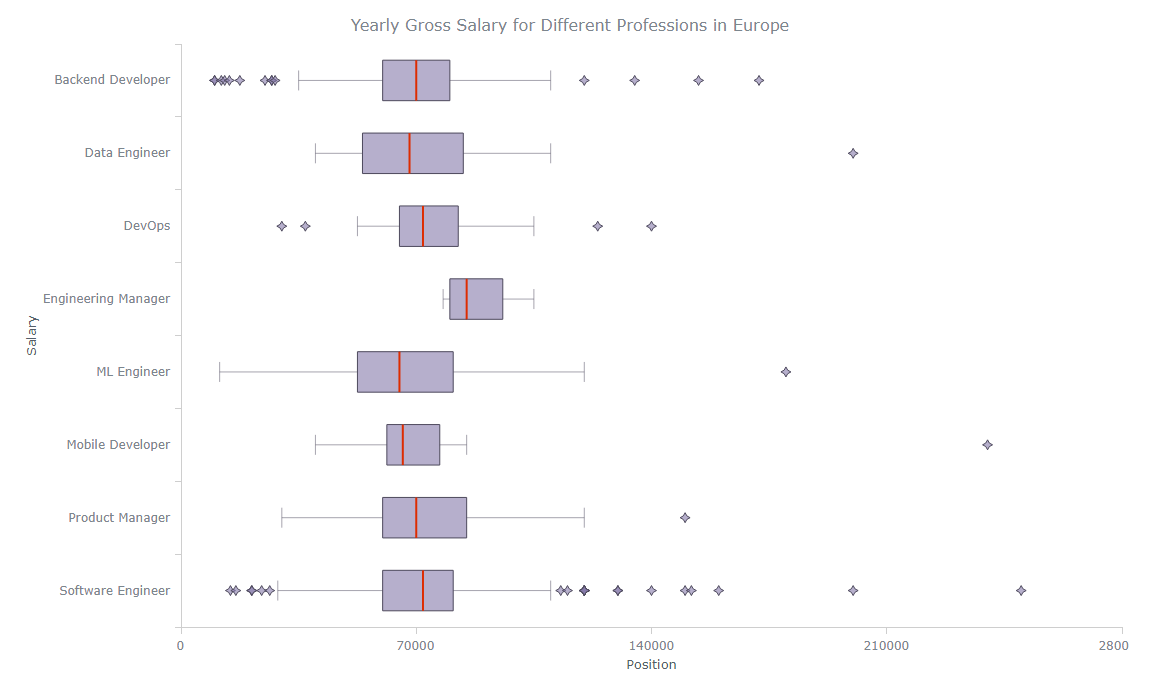
Doesn’t it look great? Keep reading to find out how to create it.
Basic Box-and-Whisker Plot
If you already have experience in creating charts with JavaScript, you should have a basic understanding of how it works. However, if you are a beginner, this box plot tutorial will guide you step-by-step. Let’s start with an overview of the steps involved:
Create a webpage in HTML.
Include necessary JavaScript files.
Set the data.
Add JavaScript code.
You can create a stunning basic box-and-whisker plot with just a few lines of code. Additionally, I will show you some interesting customizations to enhance the chart’s appearance. Let’s dive in!
1. Create a webpage in HTML
We will be working with JavaScript, so first of all, we need to use HTML to create a webpage to display our box chart.
We’ll start by setting the webpage’s title to “JavaScript Box-and-Whisker Plot.” Next, we’ll include a few lines of CSS code within the style tag to set the margin and padding to 0; and make the height and width of the webpage 100%. Doing that will ensure that the chart is displayed properly on the webpage.
Finally, we’ll add a div tag with the id “container”. We’ll use this div to hold the box plot later on.
<!DOCTYPE html>
<html lang="en">
  <head>
    <meta charset="utf-8">
    <title>JavaScript Box-and-Whisker Plot</title>
    <style type="text/css">
      html, body, #container {
        width: 100%;
        height: 100%;
        margin: 0;
        padding: 0;
      }
    </style>
  </head>
  <body>
    <div id="container"></div>
  </body>
</html>
2. Include necessary JavaScript files
After completing the basic layout of our HTML webpage, the next step is to include the necessary JavaScript files. We need to include the link to the JavaScript charting library in the head section of our HTML webpage.
For this purpose, we will use AnyChart. We will need the Core and Basic Cartesian modules for our box-and-whisker chart.
<!DOCTYPE html>
<html lang="en">
  <head>
    <meta charset="utf-8">
    <title>JavaScript Box-and-Whisker Plot</title>
    <script src="https://cdn.anychart.com/releases/8.11.0/js/anychart-core.min.js"></script>
    <script src="https://cdn.anychart.com/releases/8.11.0/js/anychart-cartesian.min.js"></script>
    <style type="text/css">
      html, body, #container {
        width: 100%;
        height: 100%;
        margin: 0;
        padding: 0;
      }
    </style>
  </head>
  <body>
    <div id="container"></div>
    <script>
      // All the code for the JS Box-and-Whisker Plot will come here
    </script>
  </body>
</html>
3. Set the data
We will be using data on yearly gross salaries for different professions in Europe, sourced from the IT Salary Survey for the EU region (2018-2020), available on Kaggle.
After cleaning the data to remove duplicates and incorrectly formatted or misleading data, I selected only professions with sufficient data and calculated their averages. I then chose the top 8 IT professions for our box-and-whisker visualization.
The data is represented as an array of objects, with each object representing a profession. The object properties display the profession name, first quartile, median, third quartile, minimum and maximum values, and outlier values.
var data = [
  {
    x: 'Backend Developer',
    low: 35000,
    q1: 60000,
    median: 70000,
    q3: 80000,
    high: 110000,
    outliers: [10001, 10001, 12000, 13000, 14400, 17500, 25000, 27000, 27000, 28000, 120000, 135000, 154000, 172000]
  },
  {
    x: 'Data Engineer',
    low: 40000,
    q1: 54000,
    median: 68000,
    q3: 84000,
    high: 110000,
    outliers: [200000]
  },
  {
    x: 'DevOps',
    low: 52500,
    q1: 65000,
    median: 72000,
    q3: 82500,
    high: 105000,
    outliers: [30000, 37000, 124000, 140000]
  },
  {
    x: 'Engineering Manager',
    low: 78000,
    q1: 80000,
    median: 85000,
    q3: 95750,
    high: 105000
  },
  {
    x: 'ML Engineer',
    low: 11500,
    q1: 52500,
    median: 65000,
    q3: 81000,
    high: 120000,
    outliers: [180000]
  },
  {
    x: 'Mobile Developer',
    low: 40000,
    q1: 61250,
    median: 66000,
    q3: 77000,
    high: 85000,
    outliers: [240000]
  },
  {
    x: 'Product Manager',
    low: 30000,
    q1: 60000,
    median: 70000,
    q3: 85000,
    high: 120000,
    outliers: [150000]
  },
  {
    x: 'Software Engineer',
    low: 28800,
    q1: 60000,
    median: 72000,
    q3: 81000,
    high: 110000,
    outliers: [14712, 16320, 21000, 21120, 24000, 26400, 113000, 115000, 120000, 120000, 120000, 120000, 120000, 120000, 130000, 130000, 140000, 150000, 151872, 160000, 200000, 250000]
  }
];
4. Add JavaScript code
Finally, let’s write some JavaScript code to get our chart up and running.
We will include the onDocumentReady() function of the charting library and enclose our code with it to ensure that the data is represented on the screen once the HTML webpage is fully loaded.
<script>
  anychart.onDocumentReady(function () {
    // The box chart's code will be written here.
  });
</script>
First, we add our data from Step 3.
anychart.onDocumentReady(function () {
  var data = [
    {
      x: 'Backend Developer',
      low: 35000,
      q1: 60000,
      median: 70000,
      q3: 80000,
      high: 110000,
      outliers: [10001, 10001, 12000, 13000, 14400, 17500, 25000, 27000, 27000, 28000, 120000, 135000, 154000, 172000]
    },
    {
      x: 'Data Engineer',
      low: 40000,
      q1: 54000,
      median: 68000,
      q3: 84000,
      high: 110000,
      outliers: [200000]
    },
    {
      x: 'DevOps',
      low: 52500,
      q1: 65000,
      median: 72000,
      q3: 82500,
      high: 105000,
      outliers: [30000, 37000, 124000, 140000]
    },
    {
      x: 'Engineering Manager',
      low: 78000,
      q1: 80000,
      median: 85000,
      q3: 95750,
      high: 105000
    },
    {
      x: 'ML Engineer',
      low: 11500,
      q1: 52500,
      median: 65000,
      q3: 81000,
      high: 120000,
      outliers: [180000]
    },
    {
      x: 'Mobile Developer',
      low: 40000,
      q1: 61250,
      median: 66000,
      q3: 77000,
      high: 85000,
      outliers: [240000]
    },
    {
      x: 'Product Manager',
      low: 30000,
      q1: 60000,
      median: 70000,
      q3: 85000,
      high: 120000,
      outliers: [150000]
    },
    {
      x: 'Software Engineer',
      low: 28800,
      q1: 60000,
      median: 72000,
      q3: 81000,
      high: 110000,
      outliers: [14712, 16320, 21000, 21120, 24000, 26400, 113000, 115000, 120000, 120000, 120000, 120000, 120000, 120000, 130000, 130000, 140000, 150000, 151872, 160000, 200000, 250000]
    }
];
Next, we create our box-and-whisker plot specifying the chart type as the “box”. We create a box series and pass our data into it.
var chart = anychart.box()
var series = chart.box(data);
After that, we add the chart title and set the container referencing the div element we had given an id of “container” in Step 1.
chart.title('Yearly Gross Salary for Different IT Professions in Europe');
chart.container('container');
Finally, we draw the chart using the draw() function.
chart.draw();
This is what the basic interactive JS box-and-whisker plot looks like! The complete code of the HTML webpage is provided below. You can also find the interactive version of this chart on AnyChart Playground.

<!DOCTYPE html>
<html lang="en">
  <head>
    <meta charset="utf-8">
    <title>JavaScript Box-and-Whisker Plot</title>
    <script src="https://cdn.anychart.com/releases/8.11.0/js/anychart-core.min.js"></script>
    <script src="https://cdn.anychart.com/releases/8.11.0/js/anychart-cartesian.min.js"></script>
    <style type="text/css">
      html, body, #container {
        width: 100%;
        height: 100%;
        margin: 0;
        padding: 0;
      }
    </style>
  </head>
  <body>
    <div id="container"></div>
    <script>
      anychart.onDocumentReady(function () {
        var data = [
          {
            x: 'Backend Developer',
            low: 35000,
            q1: 60000,
            median: 70000,
            q3: 80000,
            high: 110000,
            outliers: [10001, 10001, 12000, 13000, 14400, 17500, 25000, 27000, 27000, 28000, 120000, 135000, 154000, 172000]
          },
          {
            x: 'Data Engineer',
            low: 40000,
            q1: 54000,
            median: 68000,
            q3: 84000,
            high: 110000,
            outliers: [200000]
          },
          {
            x: 'DevOps',
            low: 52500,
            q1: 65000,
            median: 72000,
            q3: 82500,
            high: 105000,
            outliers: [30000, 37000, 124000, 140000]
          },
          {
            x: 'Engineering Manager',
            low: 78000,
            q1: 80000,
            median: 85000,
            q3: 95750,
            high: 105000
          },
          {
            x: 'ML Engineer',
            low: 11500,
            q1: 52500,
            median: 65000,
            q3: 81000,
            high: 120000,
            outliers: [180000]
          },
          {
            x: 'Mobile Developer',
            low: 40000,
            q1: 61250,
            median: 66000,
            q3: 77000,
            high: 85000,
            outliers: [240000]
          },
          {
            x: 'Product Manager',
            low: 30000,
            q1: 60000,
            median: 70000,
            q3: 85000,
            high: 120000,
            outliers: [150000]
          },
          {
            x: 'Software Engineer',
            low: 28800,
            q1: 60000,
            median: 72000,
            q3: 81000,
            high: 110000,
            outliers: [14712, 16320, 21000, 21120, 24000, 26400, 113000, 115000, 120000, 120000, 120000, 120000, 120000, 120000, 130000, 130000, 140000, 150000, 151872, 160000, 200000, 250000]
          }
        ];
        // create a chart
        var chart = anychart.box();
        // create a box series and set the data
        var series = chart.box(data);
        // set the chart title
        chart.title('Yearly Gross Salary for Different IT professions in Europe');
        // set the container id
        chart.container('container');
        // draw the chart
        chart.draw();
      });
    </script>
  </body>
</html>
Advanced Box-and-Whisker Plot
Even though we have built a nice basic box-and-whisker plot with JavaScript, we can go farther and apply customizations to make our chart look even more interesting. So let’s dive into some of the options available!
Adding axis labels
Customizing colors
Improving the tooltip
Rotating the plot
FOR A WALKTHROUGH OF THESE JS BOX-AND-WHISKER PLOT CUSTOMIZATIONS, CONTINUE READING THE TUTORIAL HERE.