

Welcome to this step-by-step tutorial that will empower you to create an interactive Pareto chart using JavaScript that will look nice on any device and in any browser! A Pareto chart is a captivating graphical combo representation that showcases individual values through descending bars, while a line graph illustrates the cumulative total. It is a powerful tool highlighting the relative importance of different categories within a dataset. Named after the visionary economist Vilfredo Pareto, the Pareto chart embodies the Pareto principle, also known as the 80/20 rule. This principle reveals that approximately 80% of effects stem from a mere 20% of causes. With their ability to pinpoint the most significant elements driving a specific scenario, Pareto charts have become indispensable in certain areas of data analysis. Every chart needs data, and for this tutorial, I have chosen a dataset to serve as an example for illustration. Together, we will embark on a journey to visualize the major customer complaints for consumer loans in a Pareto chart, demonstrating how easily you can achieve it at every step. So get ready, and let's dive into the world of Pareto charts and create our own interactive masterpiece!
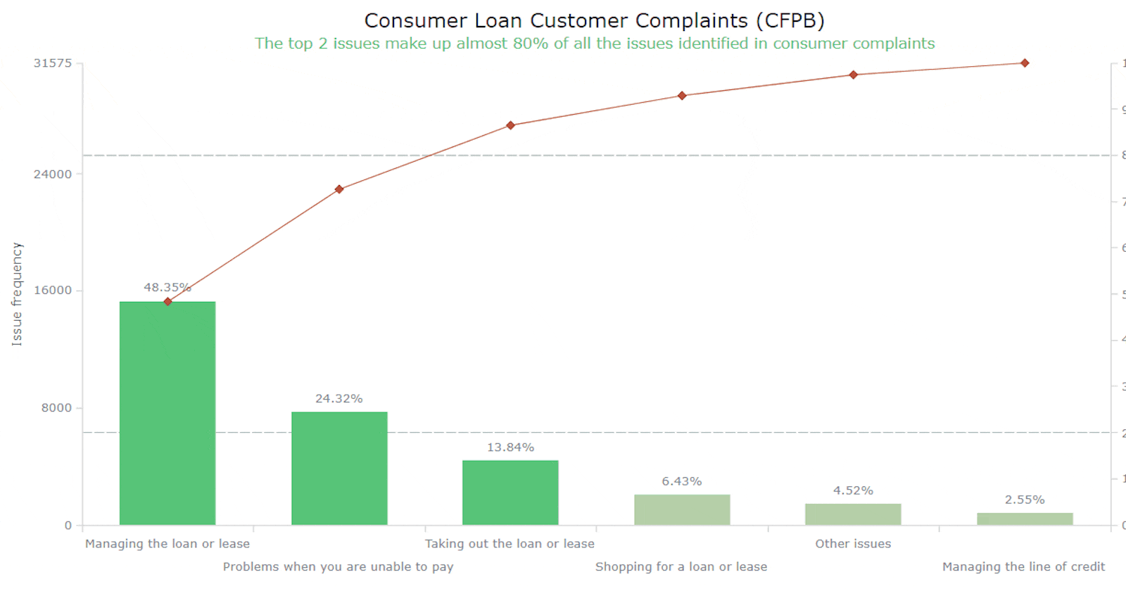
Pareto Chart to Be Created
Take a moment to behold the final Pareto chart that awaits us.
Now, let's dive into the tutorial and follow the steps to learn how to create your own interactive JS Pareto chart without any complaints.
Creating a Pareto Chart
Developing a fully functional Pareto chart is an uncomplicated task that can be completed in four steps. While having an understanding of HTML and JavaScript can be beneficial, it is optional when utilizing a decent JavaScript charting library. The basic steps are as follows:
Create an HTML container.
Incorporate the required scripts.
Input the data you want to visualize.
Configure the visualization using JavaScript.
1. Create an HTML container
To house a chart, you'll need a container. Start by crafting an HTML page that features a block-level element with a unique identifier for easy referencing. To ensure the chart fills the entire page, set the width and height parameters to 100%, or style it based on your preferences.
<html>
  <head>
    <title>Pareto Chart JavaScript</title>
    <style type="text/css">
      html, body, #container {
        width: 100%; height: 100%; margin: 0; padding: 0;
      }
    </style>
  </head>
  <body>
    <div id="container"></div>
  </body>
</html>
2. Incorporate the required scripts
In this tutorial, we will be using the AnyChart JS library as an example. However, the fundamental concepts and steps we discuss can also be applied to other charting libraries. AnyChart is a popular choice due to its extensive examples and comprehensive documentation, making it suitable for beginners and experienced professionals. We will include two essential scripts for the Pareto chart: the core library file, which is a prerequisite for all charts, and the Pareto module. Remember to add these scripts within the <script> tags in the <head> section of your HTML page. The JS charting code is to be placed within the <script> tags in the <body> section.
<html>
  <head>
    <title>Pareto Chart JavaScript</title>
    <script src="https://cdn.anychart.com/releases/8.11.1/js/anychart-core.min.js"></script>
    <script src="https://cdn.anychart.com/releases/8.11.1/js/anychart-pareto.min.js"></script>
    <style type="text/css">
      html, body, #container {
        width: 100%; height: 100%; margin: 0; padding: 0;
      }
    </style>
  </head>
  <body>
    <div id="container"></div>
    <script>
      // All the code for the JS Pareto Chart will come here
    </script>
  </body>
</html>
3. Input the data you want to visualize
Since the Pareto chart typically involves a small amount of data, it can be directly integrated:
let data = [
  { x: "Managing the loan or lease", value: 15265 },
  { x: "Problems when you are unable to pay", value: 7678 },
  { x: "Taking out the loan or lease", value: 4370 },
  { x: "Shopping for a loan or lease", value: 2029 },
  { x: "Managing the line of credit", value: 806 },
  { x: "Other issues", value: 1427 }
];
4. Configure the visualization using JavaScript
With everything now in place, let me demonstrate how just a few lines of code can quickly generate an interactive Pareto diagram using JavaScript. To ensure that the enclosed code only runs after the page is fully loaded, encapsulate it within a function like this:
<script>
  anychart.onDocumentLoad(function () {
    // the following code here
  });
</script>
Within the function, first add the data:
anychart.onDocumentLoad(function () {
  let data = [
    { x: "Managing the loan or lease", value: 15265 },
    { x: "Problems when you are unable to pay", value: 7678 },
    { x: "Taking out the loan or lease", value: 4370 },
    { x: "Shopping for a loan or lease", value: 2029 },
    { x: "Managing the line of credit", value: 806 },
    { x: "Other issues", value: 1427 }
  ];
});
Second, create a Pareto chart instance with the provided data:
let chart = anychart.pareto(data);
Third, create two Pareto series, bar (column) and line:
let column = chart.getSeriesAt(0);
let line = chart.getSeriesAt(1);
Fourth, to enhance comprehensibility, add some important captions. For example, name both Y-axes. One (for the Pareto column series) will represent the issue frequency, while the other (for the Pareto line series) will display the cumulative percentage.
chart.yAxis(0).title("Issue frequency");
chart.yAxis(1).title("Cumulative percentage");
Also, it’s always good to properly name the entire chart:
chart.title("Consumer Loan Customer Complaints (CFPB)");
Finally, set the container by referring to the HTML container created in step 1 and initiate the Pareto charting:
chart.container("container");
chart.draw();
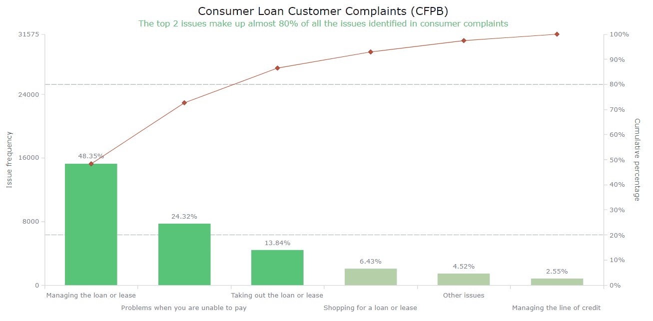
And voila! In no time, a visually appealing JavaScript-based Pareto chart displaying consumer grievances is ready! Glance at it and its resulting code below; you can see the interactive version and play with the code here. And keep reading this tutorial for some options to improve this visualization!

<html>
  <head>
    <title>Pareto Chart JavaScript</title>
    <script src="https://cdn.anychart.com/releases/8.11.1/js/anychart-core.min.js"></script>
    <script src="https://cdn.anychart.com/releases/8.11.1/js/anychart-pareto.min.js"></script>
    <style type="text/css">
      html, body, #container {
        width: 100%; height: 100%; margin: 0; padding: 0;
      }
    </style>
  </head>
  <body>
    <div id="container"></div>
    <script>
      anychart.onDocumentReady(function () {
        // add data
        let data = [
          { x: "Managing the loan or lease", value: 15265 },
          { x: "Problems when you are unable to pay", value: 7678 },
          { x: "Taking out the loan or lease", value: 4370 },
          { x: "Shopping for a loan or lease", value: 2029 },
          { x: "Managing the line of credit", value: 806 },
          { x: "Other issues", value: 1427 }
        ];
        // create a pareto chart with the data
        let chart = anychart.pareto(data);
        // set a pareto column series
        let column = chart.getSeriesAt(0);
        // set a pareto line series
        let line = chart.getSeriesAt(1);
        // name the measure axis
        chart.yAxis(0).title("Issue frequency");
        // name the cumulative percentage axis
        chart.yAxis(1).title("Cumulative percentage");
        // add a chart title
        chart.title("Consumer Loan Customer Complaints (CFPB)");
        // set the container element id for the chart
        chart.container("container");
        // initiate the pareto chart drawing
        chart.draw();
      });
    </script>
  </body>
</html>
Customizing a Pareto Chart
Creating a basic Pareto visualization was quite effortless. However, you'll be pleasantly surprised to discover how you can also easily modify the chart and enhance its aesthetics. Let me show you some ways to customize the Pareto chart and take it to the next level.
Modifying the colors
Adding labels to the columns
Improving the tooltip
Setting the interval for the right Y-axis
Adding the reference lines
Adding a crosshair
Arranging the X-axis labels
Enhancing the title
FOR A WALKTHROUGH OF THESE JS PARETO CHART CUSTOMIZATIONS, CONTINUE READING THE TUTORIAL HERE.